
Combo Chart
Famous for plotting volume (bars) alongside rate or percentage metrics (lines) on a single chart canvas.
Built as true native InDesign vector bars and spline paths with dual-axis alignment. Typography stays 100% intact, automatically following your active document Paragraph and Character Styles.
Renders on your canvas in 3–4 seconds.
No matter how much data and configuration you need.
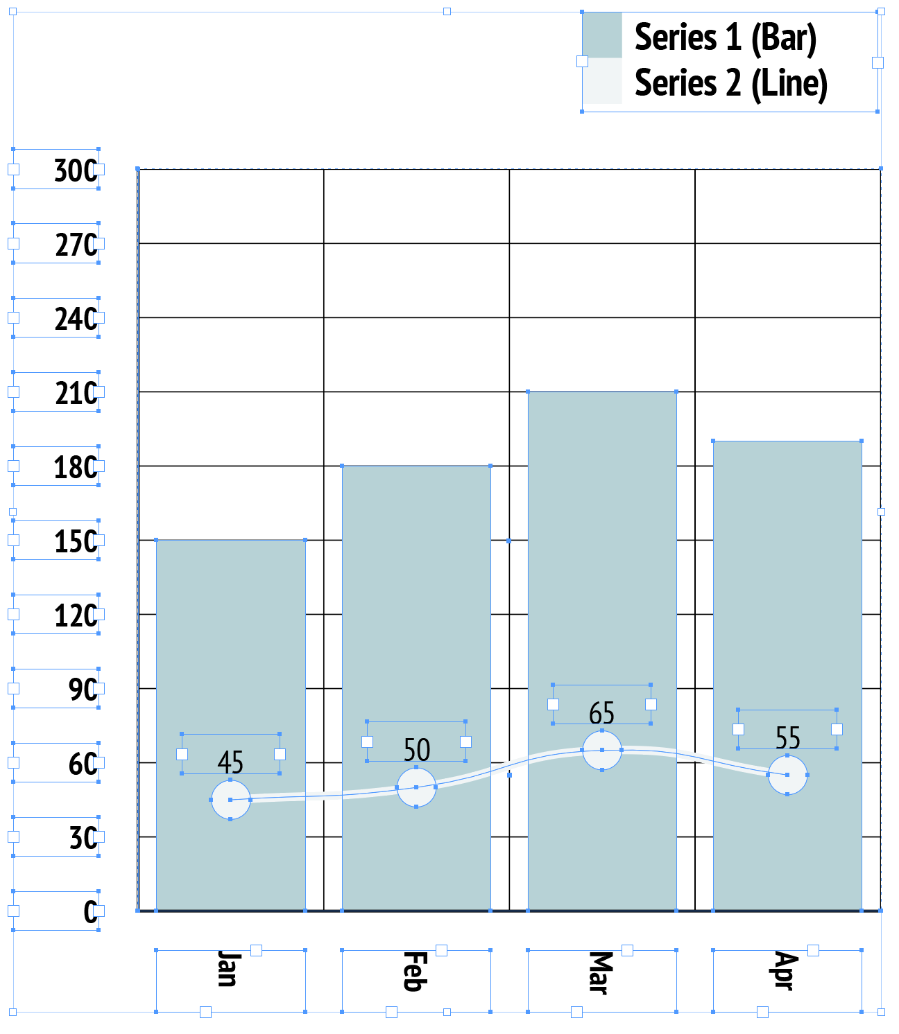
Native InDesign vector polygon selection with active handles & live swatch binding.
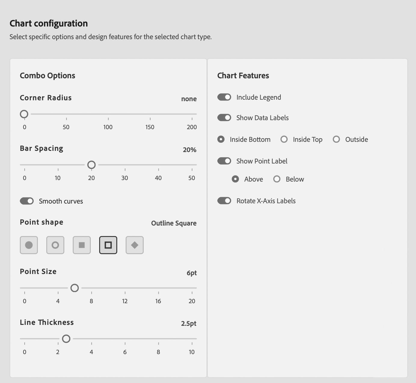
Combo Chart Editorial & Usage Rules
Volume + Rate Correlation
Ideal for showing relationship between absolute volume (e.g., Sales Revenue in $M) and percentage rates (e.g., Margin % or YoY Growth %).
Avoid Identical Scale Confusion
Do not use dual axes if metrics share the same unit or scale; use grouped bar or multi-line charts instead.
Publication Best Practices
- Axis Title Color Binding: Clearly color-code dual Y-axis title text to match corresponding bar and line swatches.
- Visual Layering: Always render bars behind lines so trend lines pass clearly across column tops.
- Zero Baseline Alignment: Synchronize primary and secondary zero baselines to avoid confusing readers.
Sample Data Table Structure
Column 1 supplies time intervals. Column 2 maps to bars (Primary Axis); Column 3 maps to line (Secondary Axis).
| Quarter | Sales Volume ($M) | Gross Margin (%) |
|---|---|---|
| Q1 | 42 | 34.5 |
| Q2 | 58 | 38.2 |
| Q3 | 75 | 41.0 |
| Q4 | 92 | 45.8 |