
Line Chart
Famous for plotting continuous time-series trends, financial stock performance, and multi-variable forecasting.
Built as true native InDesign vector paths with live stroke weights & markers. Typography stays 100% intact, automatically following your active document Paragraph and Character Styles.
Renders on your canvas in 3–4 seconds.
No matter how much data and configuration you need.
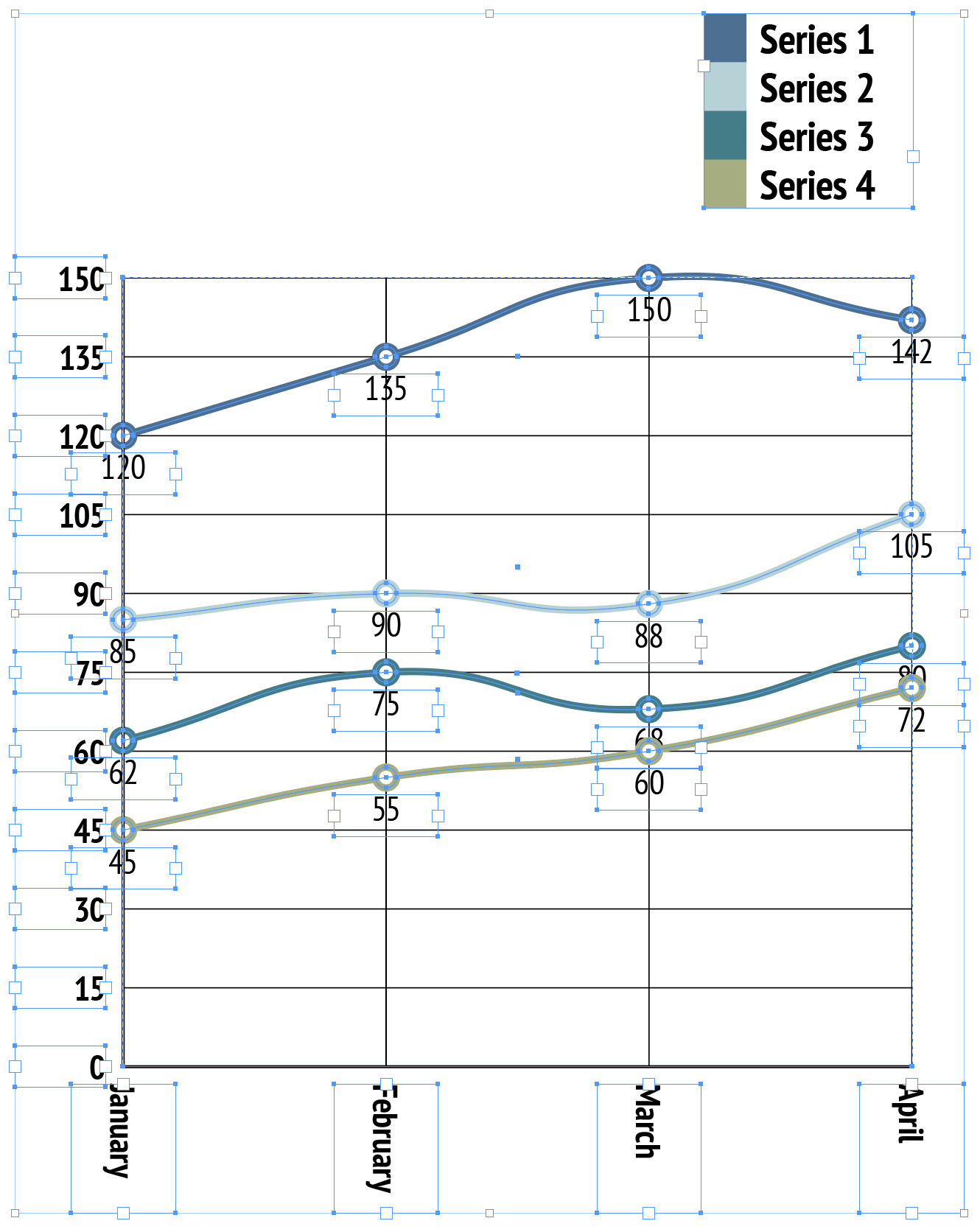
Native InDesign vector polygon selection with active handles & live swatch binding.
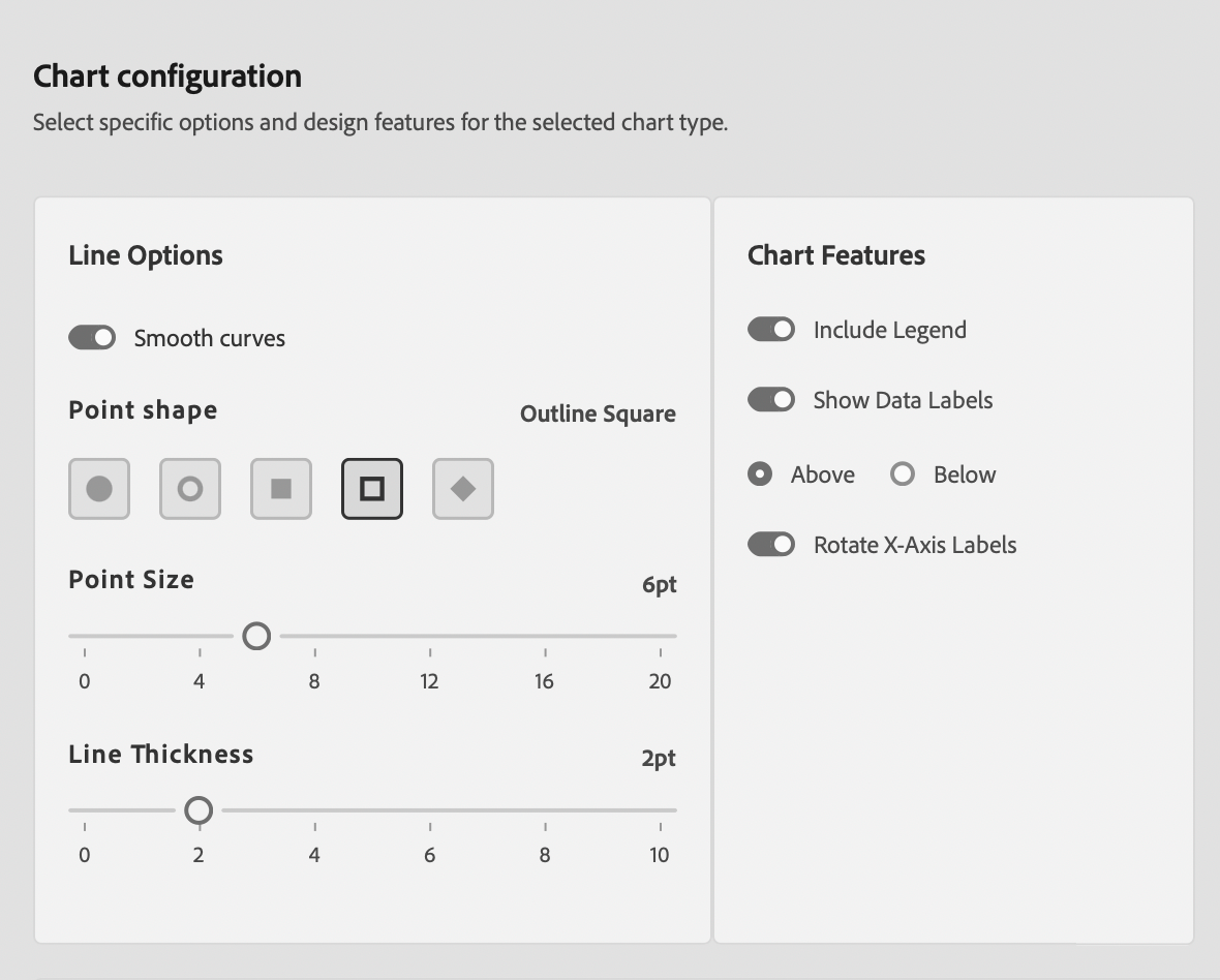
Line Chart Editorial & Usage Rules
Continuous Time-Series & Trends
Optimal for tracking continuous trends across sequential time periods (days, months, years) and multi-series line comparisons.
Avoid Unsorted Discrete Items
Do not use line charts for categorical data without natural order (e.g. country names or fruit types), as lines falsely imply continuous progression.
Publication Best Practices
- Limit Series Count: Limit to 4–5 series per chart to avoid 'spaghetti' clutter.
- Stroke Distinction: Use distinct stroke styles (solid vs dashed) or marker shapes alongside color for accessibility.
- Aspect Ratio: Maintain a 16:9 or 3:2 grid ratio so trend slopes reflect true change rate.
Sample Data Table Structure
Column 1 supplies continuous time intervals. Columns 2+ represent numeric trend series.
| Month | 2024 Revenue | 2025 Revenue | 2026 Revenue |
|---|---|---|---|
| Jan | 12 | 15 | 19 |
| Apr | 18 | 22 | 28 |
| Jul | 25 | 30 | 38 |
| Oct | 31 | 38 | 46 |