
Pie Chart
Famous for illustrating simple proportional share breakdown across a single categorical dataset.
Built as true native InDesign angular sector polygons with distinct swatch color fills. Typography stays 100% intact, automatically following your active document Paragraph and Character Styles.
Renders on your canvas in 3–4 seconds.
No matter how much data and configuration you need.
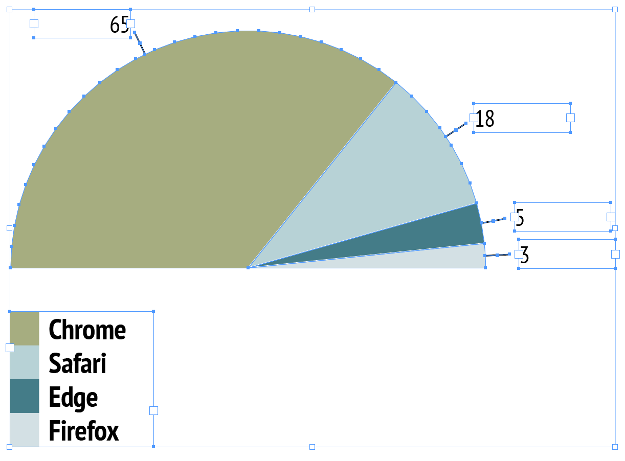
Native InDesign vector polygon selection with active handles & live swatch binding.
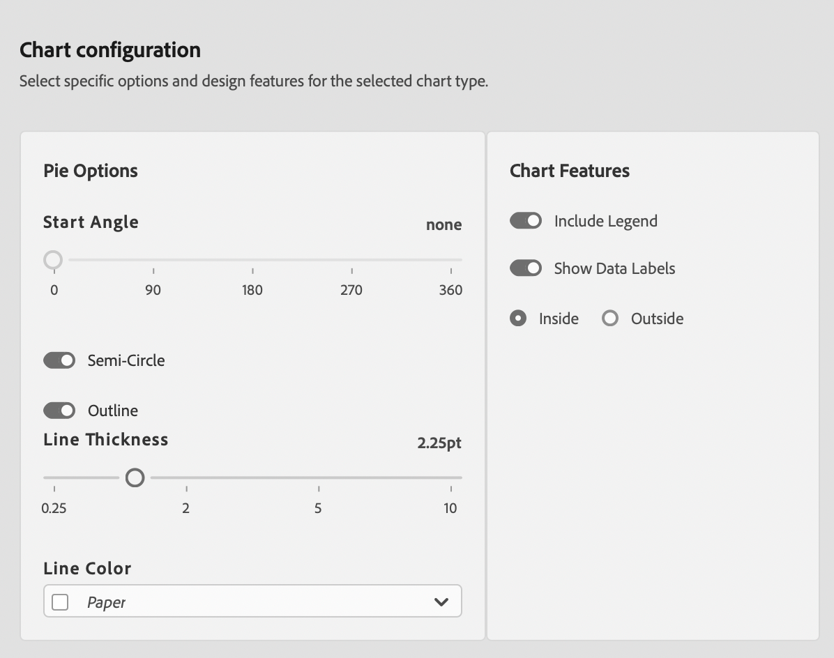
Pie Chart Editorial & Usage Rules
Simple Share Composition (2–5 Slices)
Best for showing proportional share of a single total when slice count is small (2 to 5 distinct categories).
Avoid High Slice Counts
Never use pie charts with more than 6 slices or near-identical slice sizes, as angular discrimination becomes visually inaccurate.
Publication Best Practices
- 12 O'Clock Anchor: Order slices clockwise from largest to smallest starting at 12 o'clock.
- Direct Labeling: Place percentage labels directly adjacent to slices rather than relying solely on a distant legend.
- Paper Separators: Use 1pt Paper vector strokes between slices to maintain clean print separation.
Sample Data Table Structure
Column 1 lists categorical segments. Column 2 contains numerical shares or amounts.
| Channel | Revenue Share ($M) |
|---|---|
| Direct Sales | 45 |
| Partner Retail | 30 |
| Online Store | 15 |
| Wholesale | 10 |